Services
- Event Branding
- Event Collateral
- Social Media Graphics
- Corporate Report
- Logo Design
Shaping a brand through a company's ongoing evolution to reflect its modern-day mission
OneMain Financial came to Orange Element nearly 20 years ago as one of Orange Element’s earliest clients. OneMain Financial has grown to more than 1,400 locations where they connect with community members seeking personal loans. Unlike traditional lenders, they look at the borrower’s total financial picture instead of weighing so heavily on their credit score. Our two companies have grown alongside each other, and that relationship is as strong as ever.

Like every successful business, OneMain Financial has evolved with its industry. At different points in their history, they’ve targeted different audiences, adapted their services and transformed from within — and they’ve trusted us along the way. We’re honored to be a part of their evolution as a resource for their marketing team.
It’s impossible to fully describe a decades-long relationship, so we’ve selected the following recent projects to feature.

Branding their Signature Annual Event
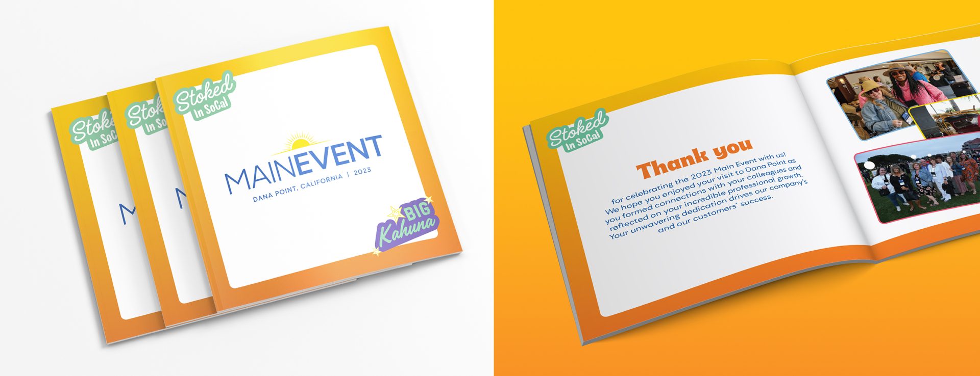
OneMain Financial holds an event in a different city each year to celebrate its highest-performing associates. For 2023, to help the annual event stand out from years past and to generate excitement among the staff, we created branding closely linked to the event’s highly desirable location: Southern California.
We developed a surf theme — including a library of icons and illustrations that shouted good times in the sun, and introduced typography and colors inspired by a surf shop look and feel. OneMain Financial’s marketing team incorporated these assets — and accompanying attitudes — throughout their internal promotions. It was clear that the 2023 event would be nothing like what their employees had experienced before. Anticipation for the event was a months-long morale booster and motivator.
2024 and Beyond
Building off of the success of their 2023 event branding, we helped create the brand for 2024’s Main Event, which took place at the Hard Rock Hotel in Ft. Lauderdale, Florida. The logo, typography, and brand elements have a grit and energy that encapsulates the “Rock Star” mentality of the employees being honored at the event.
Guiding Their LinkedIn Social Media Campaign
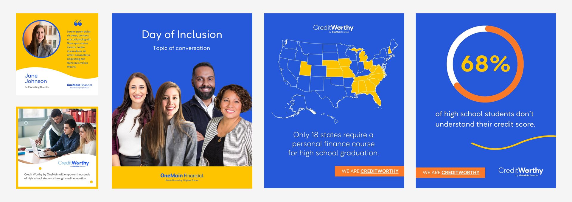
Brand consistency is essential. Colors can identify a company immediately, like Home Depot’s orange and Tiffany’s Robin’s egg blue. But, when you’re looking to capture attention on social media, a company’s traditional color palette appearing time and again becomes a blur. Our teams had recently collaborated on an updated corporate brand guide, which included a more expansive secondary color palette. We saw our chance to maximize the new palette on LinkedIn, where OneMain had already gained traction. Movement is another proven way to attract attention, so we’ve also incorporated motion graphics, animation and video. When best-performing techniques come to the surface, we’re quick to share them with OneMain’s marketing team, which enthusiastically embraces them.

Designing an Annual Report
Long-form collateral like an annual report challenges the most experienced of designers. How do you make it approachable, logical and bring a bit of personality? As we gathered content from several stakeholders, we created a template that would accommodate larger areas of text, created infographics for ease of understanding and visual variety, and created a color-coded system for content organization. The end product brought coherence, piqued interest and clearly expressed their evolved brand.
Forever evolving, OneMain Financial has pivoted towards a more digital-focused approach. The trust we have built over two decades gives them the comfort level to welcome our insights and outside perspectives on digital marketing. Their marketing team challenges us, and we respectfully do the same.