Services
- Branding & Brand Strategy
- Market Research
- Naming & Identity
- Brand Messaging & Copywriting
- Photo Shoot
- Sales Collateral
- Signage
- Web Design
The Brick Companies is a real estate group based in the DC-area. From offices to apartment buildings to golf courses and more, they work to create memorable places for current and future generations through social responsibility and environmental leadership. In recent years, they began to see major growth in the coworking market, and thought “we can do it better.” And with that, the idea to activate spaces within the properties they own and throughout the region was born.
They took a look at other players in the space, largely geared towards creative industries and tech, and decided they wanted to create something more forward-thinking, flexible, and inclusive. Anyone who needed space and community would be welcome.
In 2014, The Brick Companies came to us to help create a name and identity for their new coworking spaces. We began with a series of initial meetings where we learned about the business plan and asked exploratory questions about their vision for the business. Then, with a solid understanding of their goals and audience, we conducted market research, identifying competitors and comparators, and forming a picture of the existing coworking landscape. All of these pieces then came together to inform a set of unique brand tenets that would set them apart from the likes of Regus and WeWork.
The coworking trend was real, and still young—the perfect balance for the addition of a thoughtfully-designed concept that is modern but not “hip,” flexible but not flippant, and productive and professional, but with personality. Thus, the new operation would stand for flexibility, freedom, collaboration, stability, autonomy, and success.
From these foundational principles, we went on to a naming exercise, building a set of names and symbols that could make sense for their new offering. We explored concepts inspired by company’s origins manufacturing brick with symbols reminiscent of building, blueprints, and masonry, as well as options based on the ideas of flexibility, entrepreneurship, and community. Ultimately, the name Launch Workplaces was selected, accompanied by a logo symbol that represents separate entities coming together to form something greater than the individual parts.
We assembled a toolkit of brand and style guidelines, and their internal team used it for several years as the business moved through it’s early growth phases. Their vision was a good one: Launch Workplaces started seeing success and was gaining momentum quickly. In 2018, they found themselves in need of professional marketing and sales collateral, so The Brick Companies gave us another call.
“When we first started Launch, I didn’t know how important branding was. Orange Element did. They spent the time they needed to completely understand our vision, from where we were starting to our wildest aspirations. They conveyed those many conversations into imagery and graphics that resonate with us. As I look at our brand today, it still has meaning for us. It still conveys our vision and purpose.
Orange Element made the overwhelming task of branding and logo design easy for us. They studied us, listened to us, and gave us a handful of options that helped define us. There is no other group that will ever do that work for me.”
-Mike Kriel, CEO, Launch Workplaces
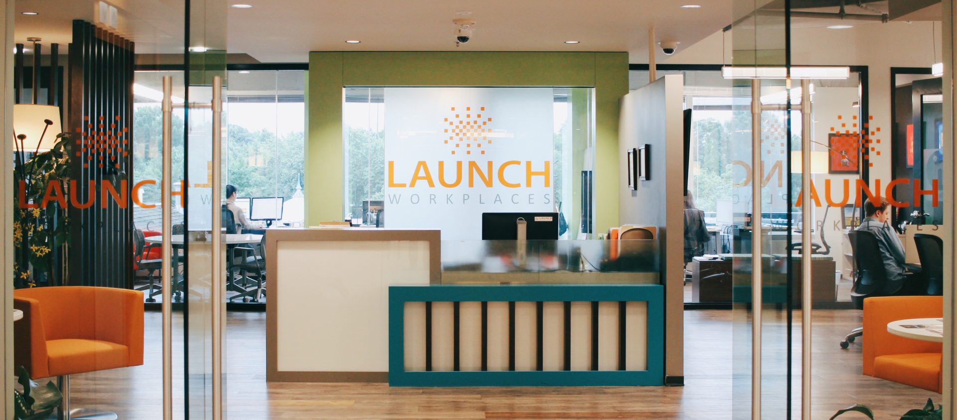
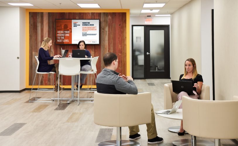
With several locations established throughout the Chesapeake region and a more robust marketing plan, Launch Workplaces saw a need for a full suite of print and digital pieces to promote their business. This initiative required pieces that can stand alone, or function as part of a larger kit; that represent individual locations, but remain within the brand system; that educate users about coworking spaces while promoting Launch specifically.
Content Audit
To start, we audited their existing collateral and content. We also compiled a list of functional requirements—from explaining location perks to displaying floor plans—and developed a new list of tangible pieces that would be used to execute these goals. Then we went to work refining and building upon their marketing language and expanding the brand system to accommodate each of the new pieces.
Building upon the System
This included distilling their marketing positioning/selling points to a few high-level points: flexible office spaces, prime locations, a variety of services and amenities, robust community, and unparalleled value. Visually, it meant the introduction of a new font to round out type system, a new color for a punch of contrast, and new graphic elements that riff off of the logo symbol of squares.
Sales Kit
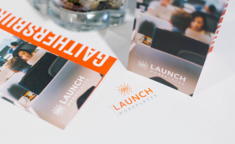
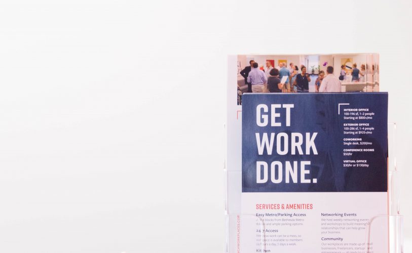
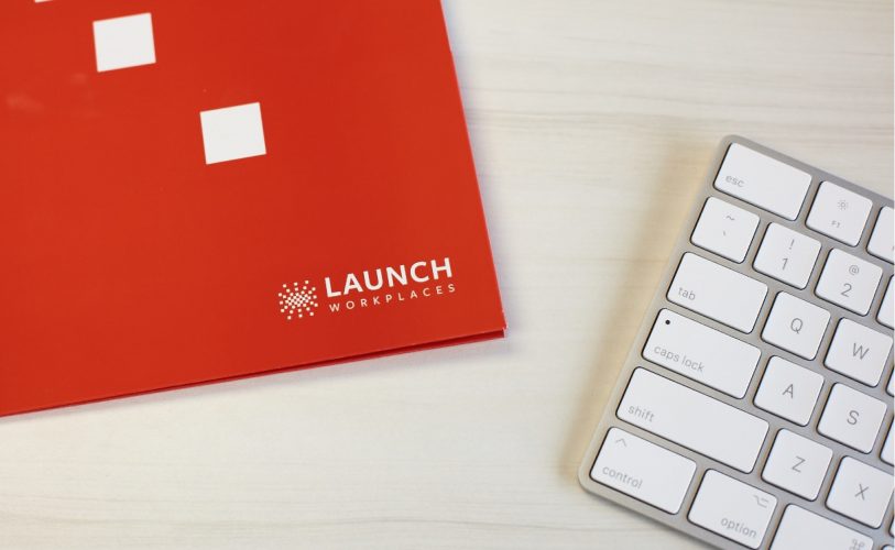
The end result is a collection of print collateral: a location specific brochure, location specific one pagers, various benefit flyers, and rate cards, all housed within a sleek branded folder. These pieces are complemented by a series of templates for flyers, table stands, longform documents, and on-screen promotional graphics.
From Concept to Detail
Our focus was two-fold: create pieces that are aesthetically compelling, but that also act as effective sales tools. And we worked to execute these goals at every level of the design, from the broad concept to the fine details.
The location specific brochures each follow the same format, providing information about location, office offerings, and amenities in the same places across each piece; but they are easily distinguished from one another at a glance through the use of varied photography and bold labeling. Rate cards utilize simplified floor plans and color coding for easy interpretation, but are also printed on uncoated paper so sales reps can quickly jot notes on them for prospective customers. Digital templates utilize the same content types as printed templates, but with reduced word counts and digitally-optimized aspect ratios.
It all has to look good, but it also must function seamlessly.
Photography
Our involvement didn’t stop there. Instead of simply handing off the finished collateral and a set of templates, we were there to make sure that the Launch team had all of the tools they needed to successfully market their office spaces. And one of the keys to doing so is top-notch photography. We created mood boards, compiled shot lists, hired photographers, and spent days providing on-site art direction to ensure that their promotional resources are as beautiful and lively as the spaces themselves.
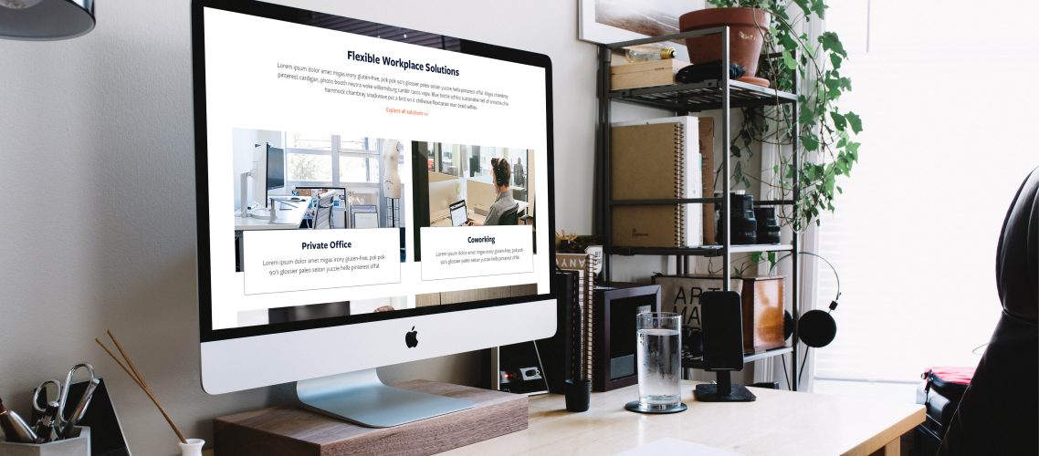
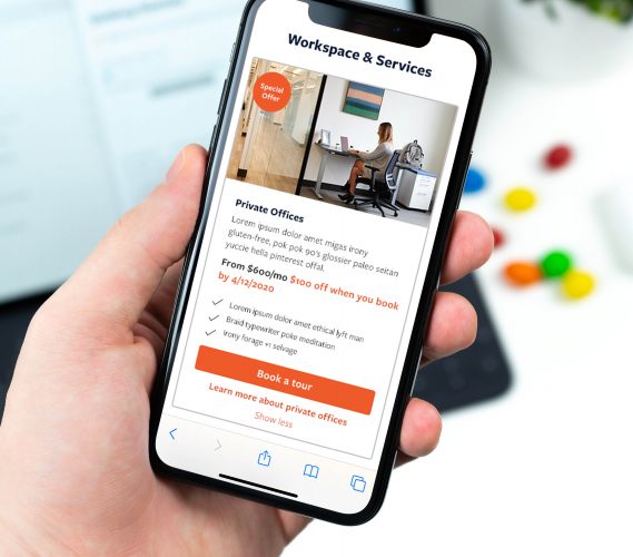
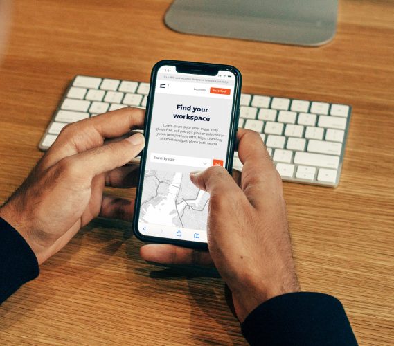
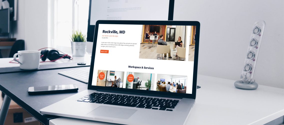
With an ever-growing list of locations and service offerings, Launch Workplaces quickly came to find that their existing website couldn’t accommodate their needs in a clear and user-friendly manner. First and foremost, they needed a new customer flow that enabled people to easily browse the different locations and services, as well as view pricing, make inquiries, and schedule tours. A refreshed aesthetic to complement their print pieces and a management-friendly back-end were also on the todo list.
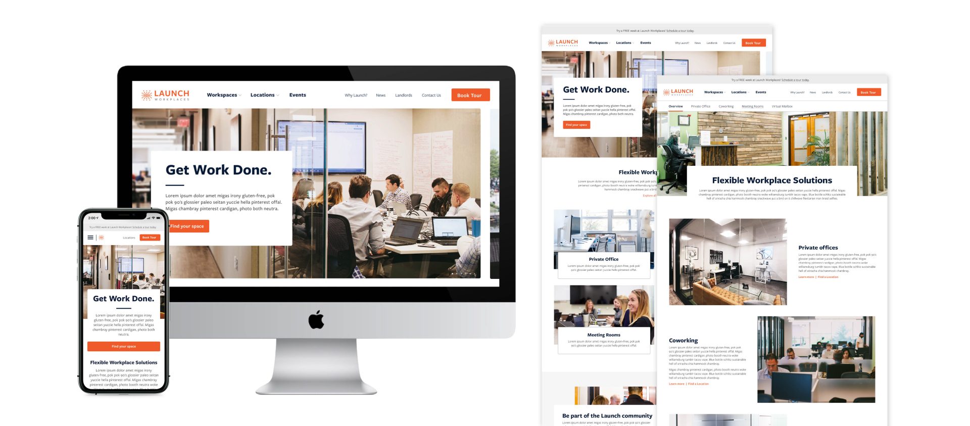
We took inventory of all of their internal and user needs and got to work revamping and optimizing their site architecture, creating main pages for workspace offerings, amenities offered, events and updates, as well as a flow for selecting and learning about individual locations.
A new, clean aesthetic was then implemented across the new site structure, creating a beautiful yet function-forward interface experience.
Because the business was seeing so much success, The Brick Companies looked to expand Launch Workplaces beyond their own properties with a franchise model. In addition to marketing towards entrepreneurs and business owners, they needed collateral to promote their concept to other property owners and landlords. This required a different set of selling points that prop up the Launch model in contrast to traditional leasing models.
We gathered their existing content and language surrounding the franchise model and fine-tuned it into a concise, persuasive set of information about what coworking is, why it’s working in the market, and how it benefits an owner’s business. We then translated this information into a printed brochure and a franchise-specific landing page, complete with motion graphics to convey building activation and animated icons that depict the various benefits of a coworking space to a business owner.
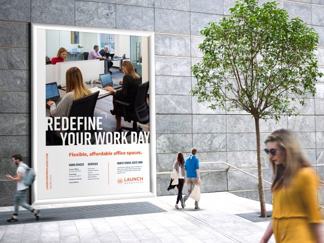
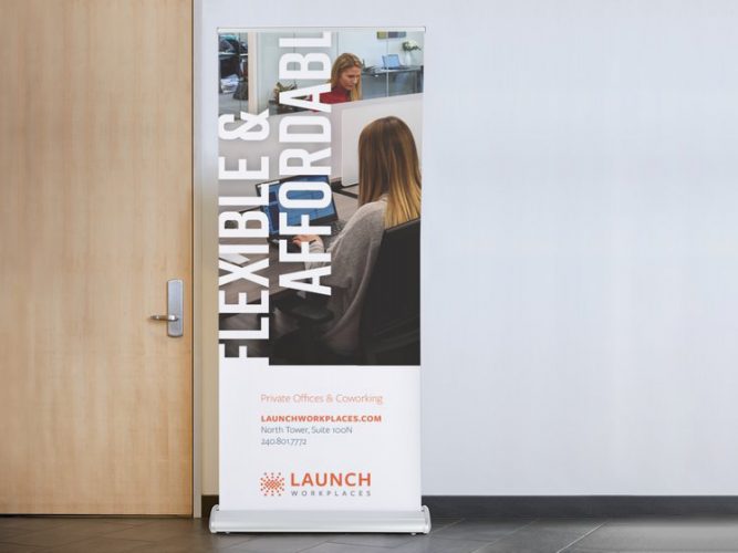
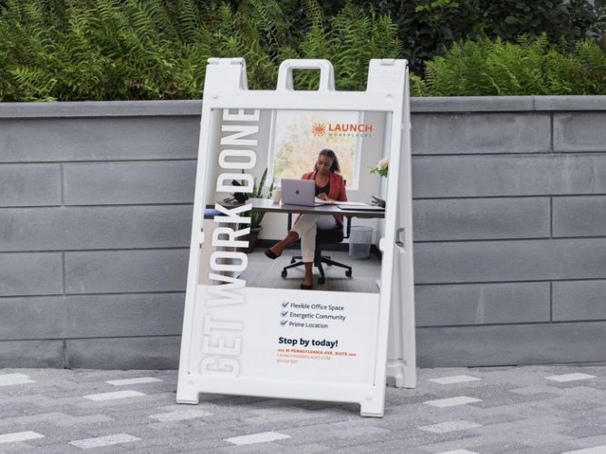
As they look towards additional growth and competition with big-name coworking spaces, Launch Workplaces continues to need attention-grabbing marketing pieces that generate interest in organic ways. Due to the prime locations of their coworking spaces, environmental signage plays a large part in this. So we’ve designed an ongoing suite of building signs and banners to help grow awareness in places where Launch already exists.
“The Orange Element team puts in the time and effort to truly get to know the business and, in turn, create beautiful graphics. We have used several graphic design and marketing agencies over the years, but we always find ourselves comparing to the work done by Orange Element.
When I need a strategic and compelling marketing piece, they are my go-to. From our early startup stages in creating a brand kit and logo, to our recent completion of a full collateral kit of folders, brochures, cards, banners and more, we have been impressed with the teams’ ability to take an idea and turn it into an effective end result—in a very efficient time period.
It is essential that our marketing pieces are well-conceptualized, enhance our sales experience, and communicate the essence of our business. Orange Element does that.”
-Lucas Morris, Brand Marketing Manager, Launch Workplaces