Services
- Publication Design
- Art Direction
- Brand Support Services
- Illustration Direction
- Photo Direction
- Digital Publication
- Content & Budget Management
Continually evolving our look and process to stay on the cutting edge of nursing publications.
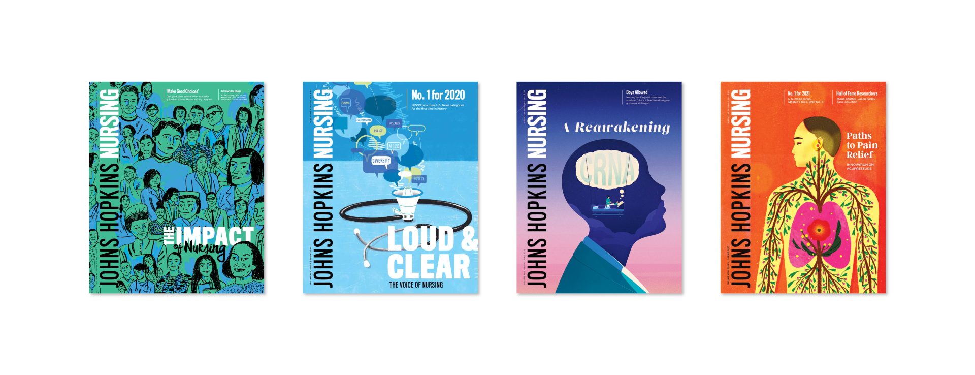
Since 2012, Orange Element has been fortunate to work collaboratively with the editor and team at the Johns Hopkins School of Nursing to produce their semi-annual print publication, the Johns Hopkins Nursing magazine.
With circulation of more than 30,000, Johns Hopkins Nursing is distributed to Johns Hopkins University School of Nursing Alumni; nurses at four Hopkins-affiliated hospitals; current, newly accepted, & prospective nursing students; nursing schools and nurse leaders; donors, friends, media, and legislators; and University hospitals and libraries.
Overhauled once before, when we began work with the School of Nursing in 2012, the magazine continues to highlight the School’s many great advancements and showcases why it consistently tops national rankings for nursing school programs by U.S. News & World Report.


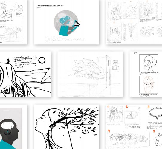
For years, the Johns Hopkins Nursing magazine has been on the forefront of excellence not only because of the School’s top-notch academic programs, but because the publication itself serves as a creative vehicle for innovation and community. In 2018, and with an eye towards keeping the magazine on the cutting edge of nursing school publications, the editorial team wanted to revamp the feel of the magazine.
Orange Element was tasked with creating a new look and structure that considered industry trends while looking head of the curve—as well as accommodating the specific needs of the Nursing magazine and its audiences.
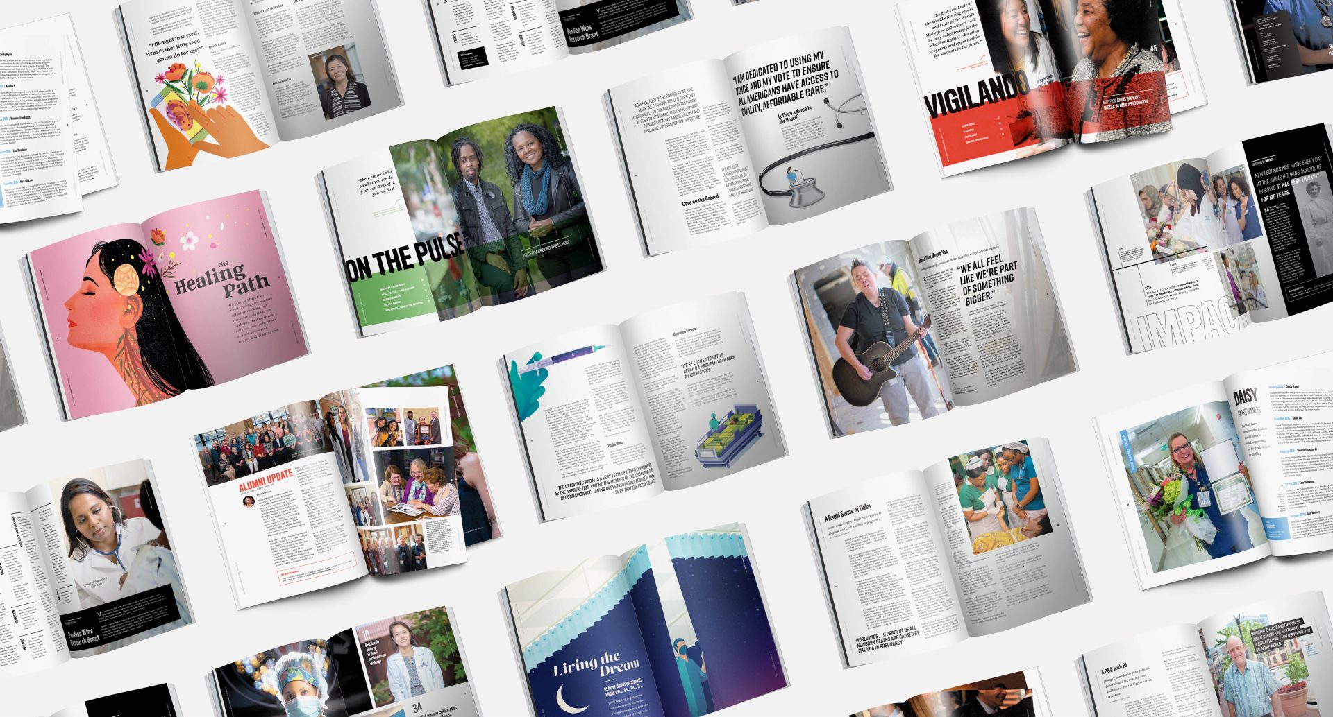
In stepping away from a rigid, academic feel and towards the likes of eye-grabbing fashion publications, the refreshed magazine design makes use of ample white space, large imagery, and playful typography. The structure of the magazine was re-considered to maintain some existing conventions while allowing for flexibility on an issue-to-issue basis, so the design can adapt to the content at hand.
Using shorter but information-rich articles allowed for more creative layouts and an emphasis on the stunning artwork of our photographers and illustrators. (And the digital counterpart would be used to complement printed articles with more expansive copywriting.)
We also increased the page count, and revisited all of the existing print specifications — improving upon everything from the paper stock to the binding method — to create a truly elevated and modern yet approachable reading experience.


Positive feedback on the redesign has been abundant: School leadership and community members alike find it a point of pride, and appreciate how it serves to keep nurses connected and up to date— from students, to faculty, to Johns Hopkins Hospital nurses.
Behind the scenes, we have had a hand in streamlining the magazine process, from managing budgets and copywriting deadlines to art directing illustrators and overseeing print production. These efforts have been so successful that Johns Hopkins School of Nursing has continually purchased increasing rights to the illustrations and photography featured in the magazines because they’re so effective and show-worthy that the marketing and admissions departments want to use them as a recruitment tool.
We are also looking forward to the next step in our partnership with the School of Nursing, updating the magazine’s online counterpart to better align with the redesigned print publication, and to better serve the needs of the nursing community in an ever-more-digital landscape. Stay tuned for the new website, slated to launch in the Summer of 2020.

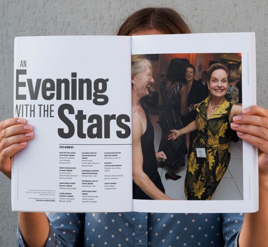

We make a good team—and we’ve made a good magazine. The redesign was a huge success. The magazine looks and feels like a million bucks.