Being a designer at an agency means you are required to juggle multiple hats in your day-to-day routine. Your day can involve sketching a new logo, creating a sitemap for an e-commerce website, or laying out a magazine. With such high demand for creativity often comes burnout. And this year, instead of letting burnout get the best of me, I decided to go back to basics.
What did “back to basics” mean to me? This meant going to the bookstore — yes, an actual bookstore — to find a design book to help spark new ideas or simply teach me something new. As designers, we often get caught up in our daily routine and forget about the importance of continuing to expand our skills.

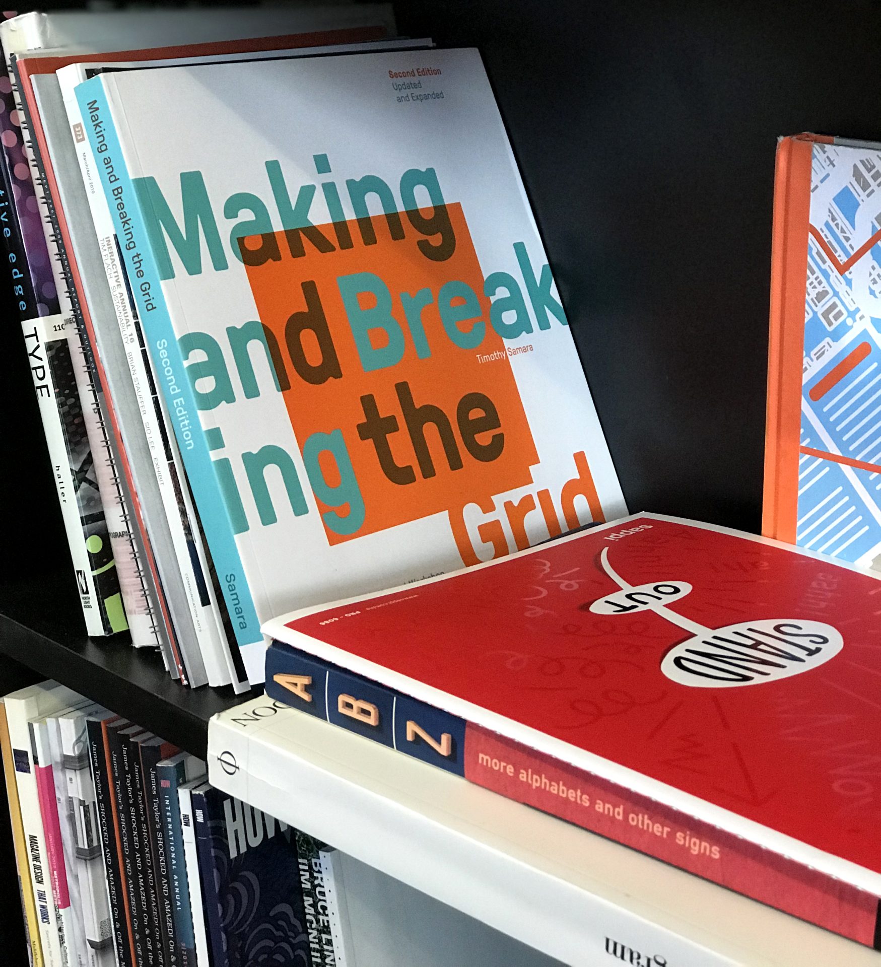
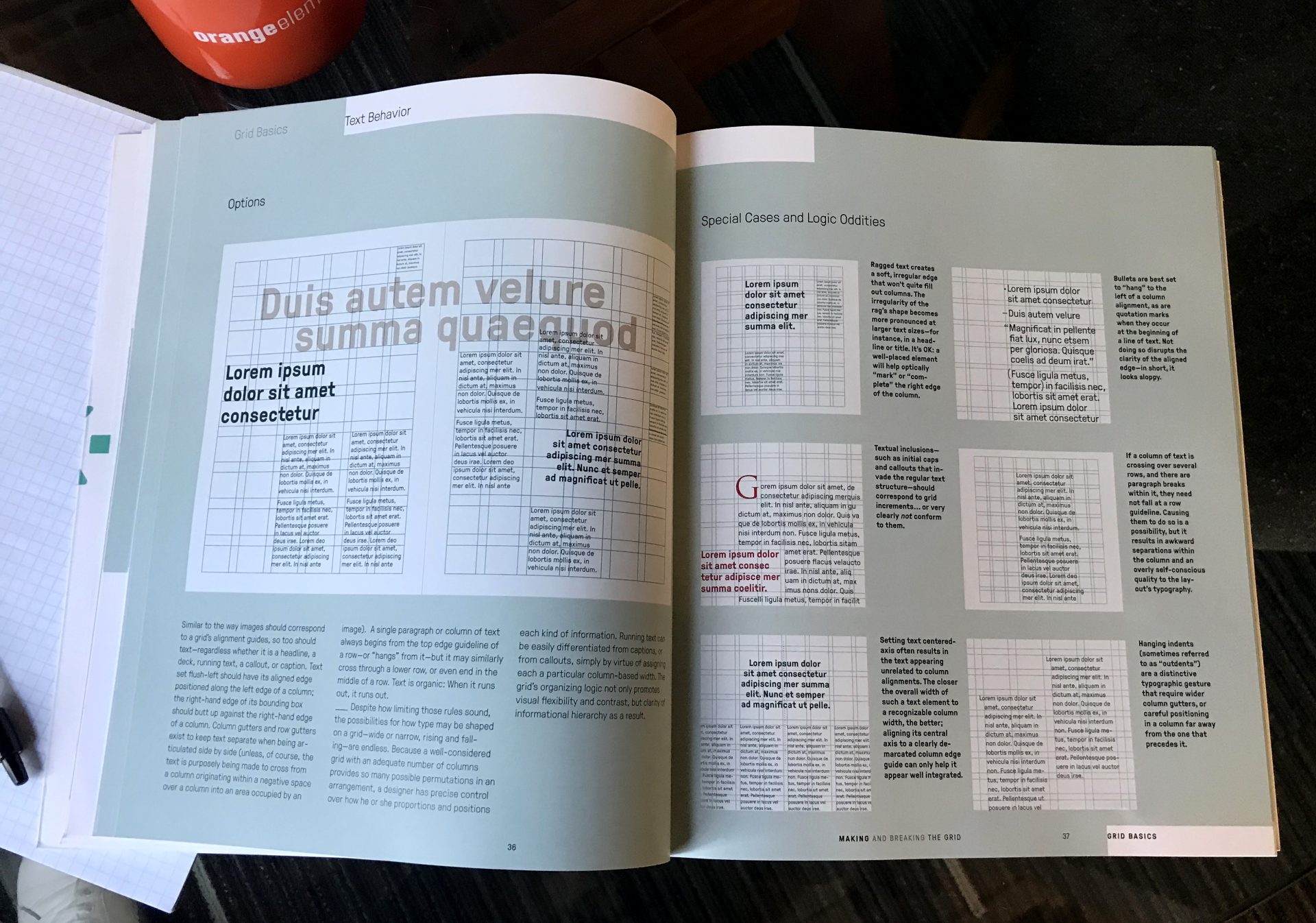
The first book that caught my eye on the shelf was Making and Breaking the Grid by Timothy Samara. This second edition book covers everything from the history of the grid, to building a grid that suits your needs, to breaking the grid in new and unexpected ways. Since we may not all have time to dive deeply into a design book, I’ve summarized two important takeaways with the hope that you will also learn something new.

1. “Every design problem is different and requires a specific grid to address it well.”
“The benefits of working with a grid are simple: clarity, efficiency, and continuity.”
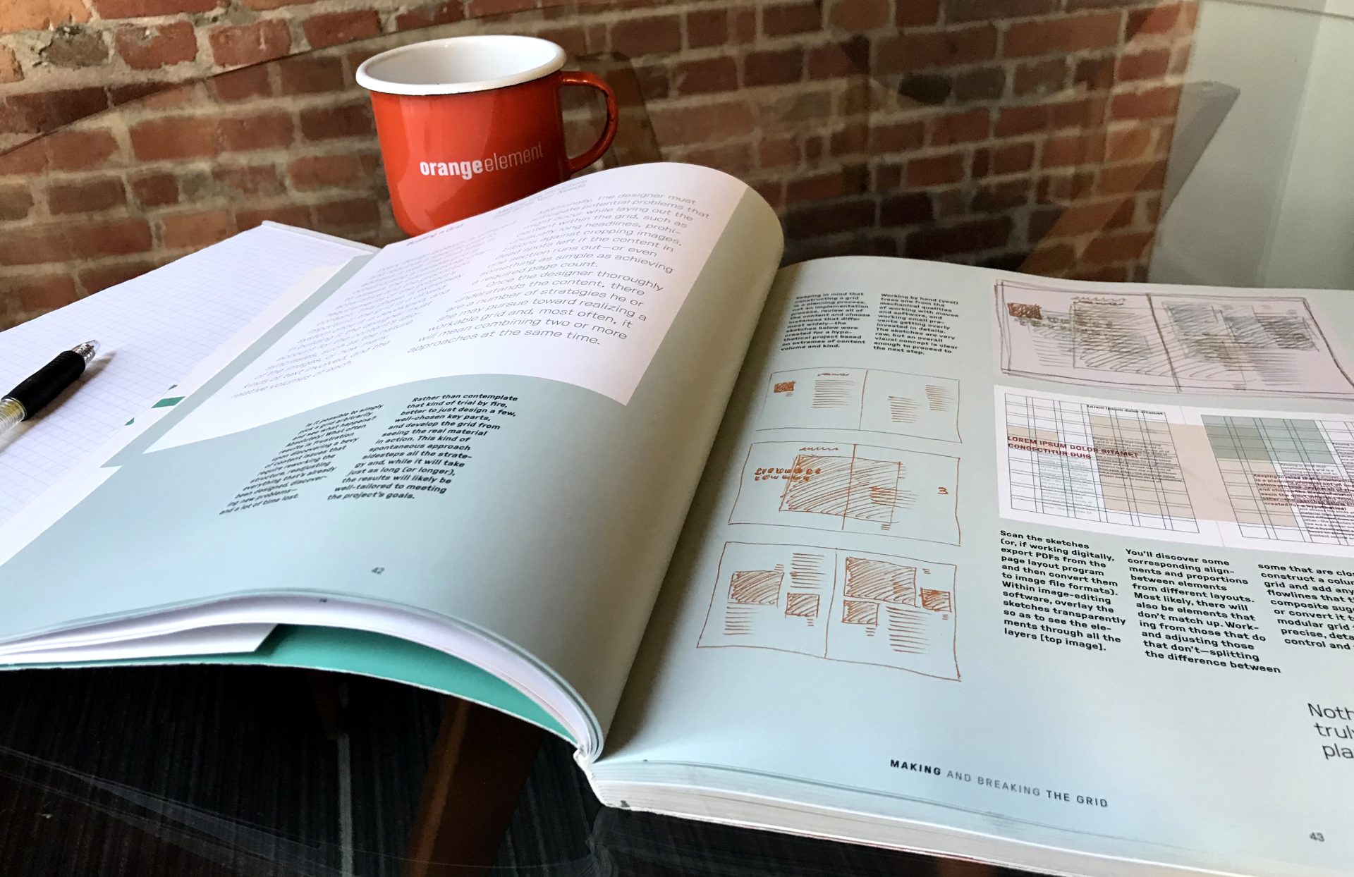
When creating a grid system for a publication, my instinct is to create a system that I believe will work, but with the main focus being on the overall look and feel of the layouts that the grid will allow for. Part of this book emphasizes how important it is to “assess the informational characteristics and the production requirements of the project’s content” before determining a system that best suits the goals of the project. “Once the designer thoroughly understands the content” they will be able to create a system that will successfully accomplish the goals of the project.

2. “A designer’s purpose is to facilitate the clearest and most compelling experience for their audience… using a grid may not offer the best solution toward that end.”
“Sometimes content must ignore structure to create specific kinds of emotional reaction.”
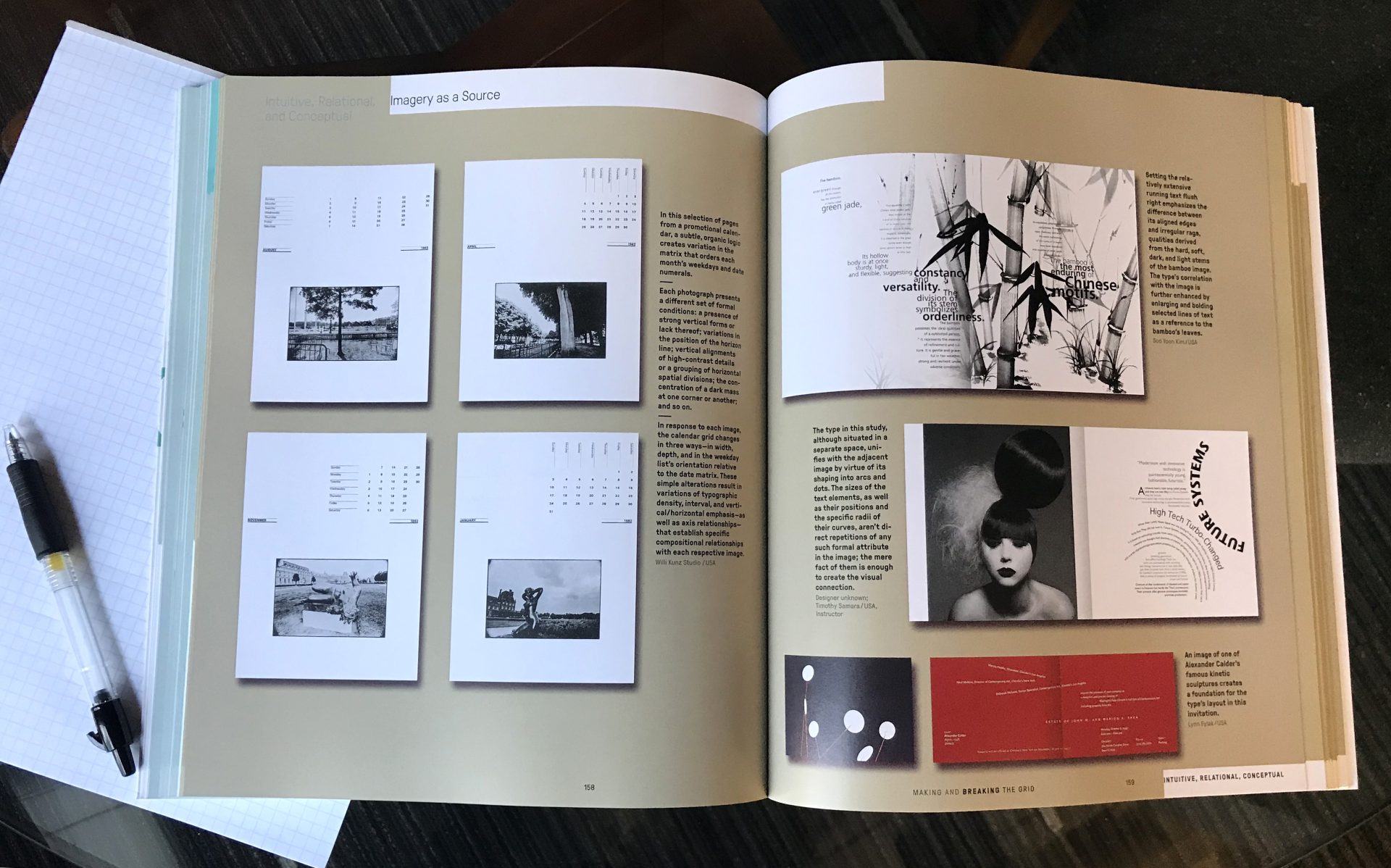
As a designer, it is important to understand that while a grid offers structure and clarity, sometimes structure and clarity are not the most important factors within a design. “Sometimes content must ignore structure to create specific kinds of emotional reaction” or “to invoke an important narrative.” Requiring the audience to work harder forces them to become more involved in the project, ultimately creating a more powerful reaction than a standard grid layout would create. However, it is important to keep in mind that this does not necessarily mean you should throw the grid out the window, but instead understand that in certain situations it can be rebelled against in order to create a specific reaction.

As you can see from two of my main takeaways from reading this book, there are really no set in stone rules we need to follow when using a grid. While it is important to understand why a grid system is useful, we should also keep in mind the impact that breaking the grid can create. I highly recommend taking a deeper dive into this book if you find yourself needing some inspiration — I personally am looking forward to using what I’ve learned the next time I’ve got my layout design hat on.


