Our office is located right across the street from Whole Foods—a bad thing for our wallets, but a great thing for our creative branding minds. Within every aisle you can find a new, unique package design, so some of our team members decided to highlight our favorite finds and expand that brand thinking even further—why the package design stands out on the shelf, how it could be improved, and how it can expand across other channels. From yogurt to coffee to chocolate, find out how we’d take some of Whole Foods’ brands further.
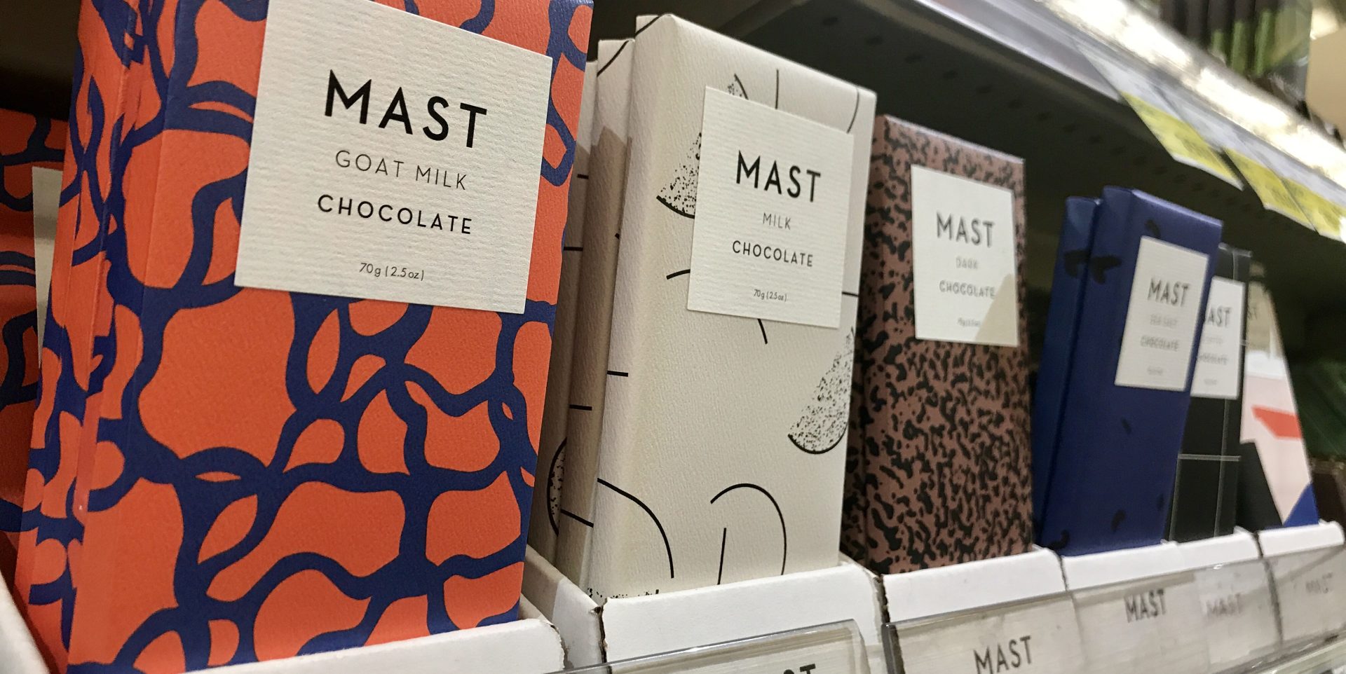
I have the biggest sweet tooth, so I’m obsessed with chocolate as it is. But Mast’s unique wrapping and textured feel makes it an obvious choice when I’m deciding which chocolate to buy. They use bold and sophisticated designs to make their products stand out among the busy and cluttered packaging of their competitors. While their packaging is special, I believe they could improve their website a bit to match the elegance of their physical product. Their homepage could filter through various packaging patterns, giving customers a unique but familiar experience every time they visit their page.
I can see this transforming into holiday wrapping paper for a winter campaign, which can also promote their chocolate as gifts. It would also be interesting to hold a design competition for the wrapping on their next flavor—unifying the country with a delicious dessert.
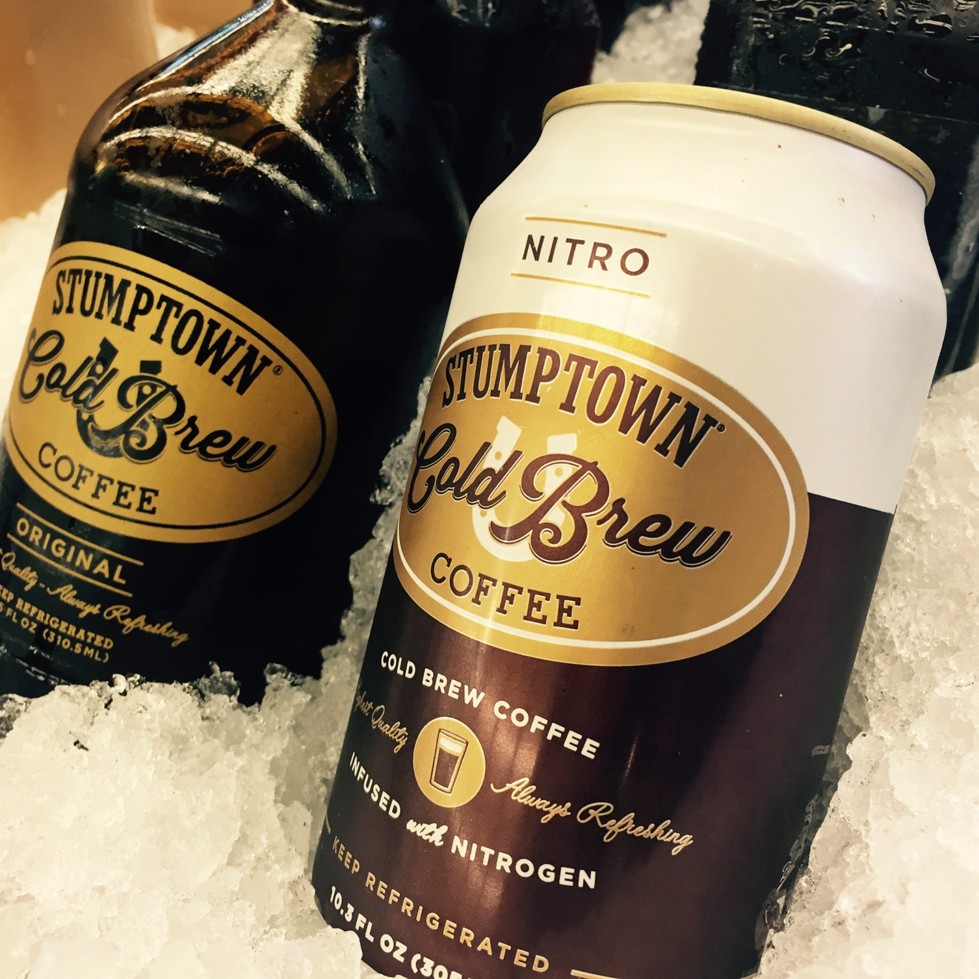
Stumptown’s packaging does a great job of communicating to consumers what’s inside without the need for too much information, and the labels are simplified down to only the core elements. This approach helps Stumptown’s packaging jump off the shelf. They use a rich, simple color palette inspired by the ingredients and beverages within, creating a true “experience” from your first interaction with the product. The typography, branding and color all put you in a specific place or frame of mind that only adds to the enjoyment of great coffee.
While the branding does a good job unifying the packaging of different product lines, the very different vessels used (paper carton, can, glass bottle) could confuse some everyday consumers. Shelf position helps, but in a crowded space, perhaps this should be considered. It would be interesting to see elements of Stumptown’s beverage packaging expanding into the packaging of their beans, and even further into the retail environment or presence at events or markets.
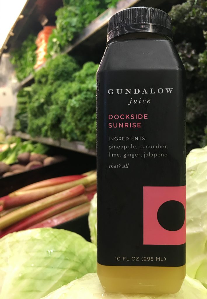
Gundalow Juice – Nicolette
This product stands out on the shelf because of its stark black packaging with just a subtle touch of color against a sea of fruit & veggie inspired color palettes. The approachable messaging allows the ingredients to speak for themselves, along with the visual brand that does the same. I also really love that they partner with local, like-minded companies to maintain the “humble” low-profile feel of the brand so consumers will feel better about themselves when drinking this juice (which is founder Dana Sicko’s mission).
I see an opportunity on their social media platforms to elevate the ingredients used to make their juice. The great thing about cold-pressed drinks is that the method maintains more of the fruits and vegetables’ nutritional value—why not show more of the nutritional side of the product? The focus is heavily on lifestyle, which is great, but it would be nice to see a better balance with that and product-driven, behind-the-scenes content.
Hi I’m Skinny Sticks – Kendall
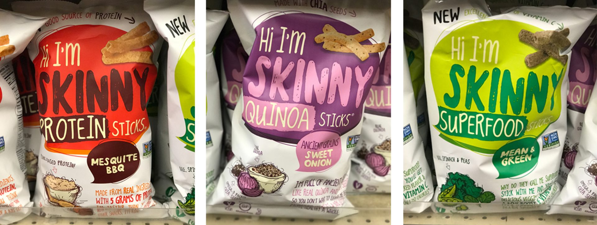
I was immediately drawn to how colorful the packaging was for Skinny Sticks. The illustrations and hand-drawn typography makes the brand playful and fun. The packaging displays a combination of hand-drawn type and quirky illustrations that makes the bags stand out against sometimes boring healthy food packaging. The use of a monochromatic color scheme for the different flavors shows variety within the brand in an interesting way. Overall, the Skinny Sticks brand is playful and approachable.
This approach, while fun and unique, can make it a bit hard to figure out the exact name of the product. Since the name varies from protein sticks, to quinoa, to superfood, I was a little confused by which company was actually behind the snack. This is a pretty minor detail because overall I find the packaging to be really fun and a good representation of their brand. I think that the illustrations they use on the different packages would lend themselves nicely to fun, playful commercials that are easily recognizable for the brand. Also, the way they personified the product by introducing the sticks on the packaging creates an opportunity to continue the “conversation” with consumers on social media.
B’more Organic – Colin
The clean, handwritten look of the typography and packaging makes me feel like it was produced with care by someone local with pride in their brand. The company presents the ingredients with transparency, which is a good strategy for their demographic—those who are focused on organic and natural food. If I were to improve upon the packaging, I would integrate the label and bottle with a full print or wrap as opposed to a pressure label, creating a seamless transition between bottle and branding. The bottom of the label pairs an illustration of mountains with a colorful reference to the flavor within–it would be nice to expand on this to bring forward the company’s passion for climbing and highlight the story of how they got started.
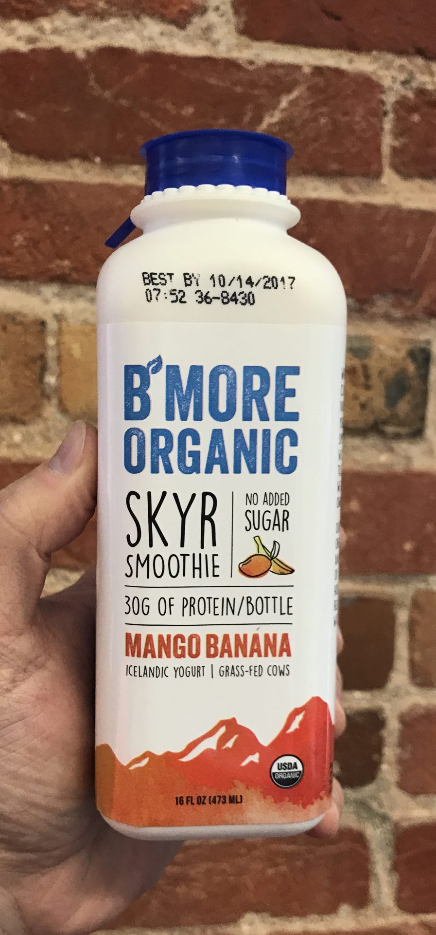
I see this brand expanding its presence at local community and promotional events, and could also see this transitioning well into video with personal, “everyday life” stories, showing someone pouring a smoothie after healthy activities to refuel, like a hike, run, or swim. It would be nice to see more partnerships with local organic brands that share the same mission as B’More Organic—they could promote their products to local and organic markets together.
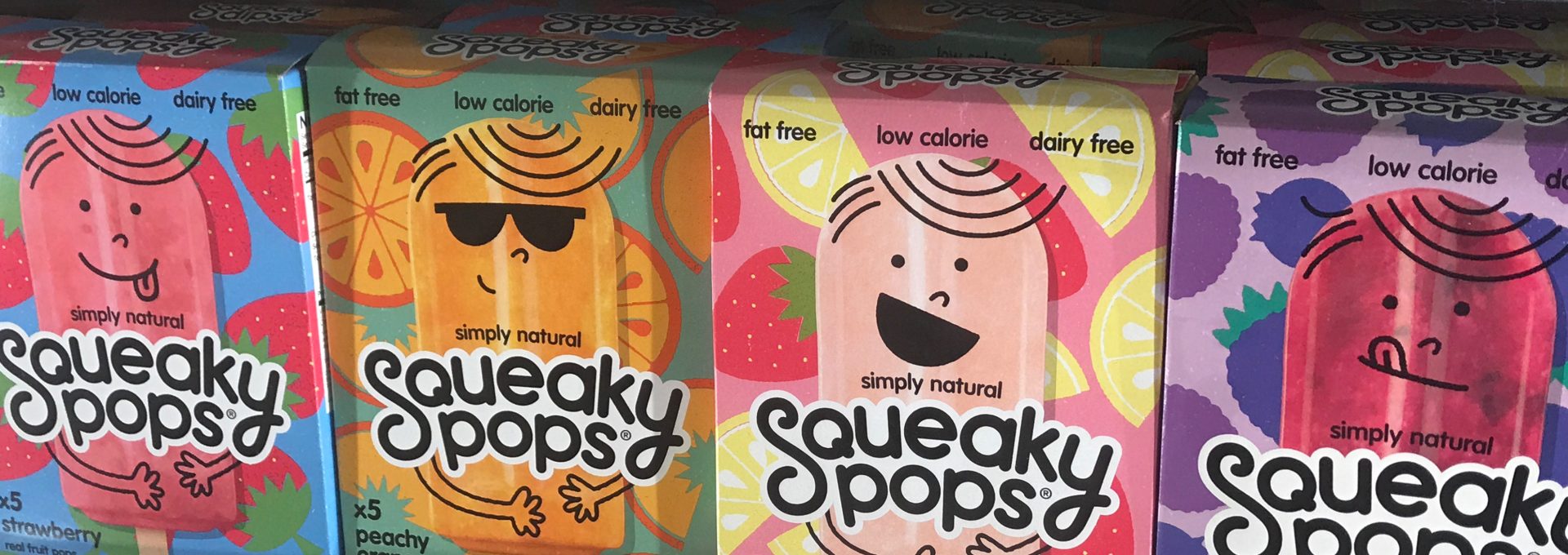
The Squeaky Pops packaging features bright happy colors, silly illustrated characters and along with the name, Squeaky Pops, the packaging reflects the fun to be found inside: popsicles. It is the only packaging in the freezer section that has characters on the boxes, setting it apart and catching one’s eye. They appeal to the kid in us all. It works because the characters are endearing and happy and the name is fun. The whole package reflects a product that isn’t serious or boring. I could see the characters illustrated on the packaging coming to life on social media, commercials, videos, etc.
Siggis – Aaron
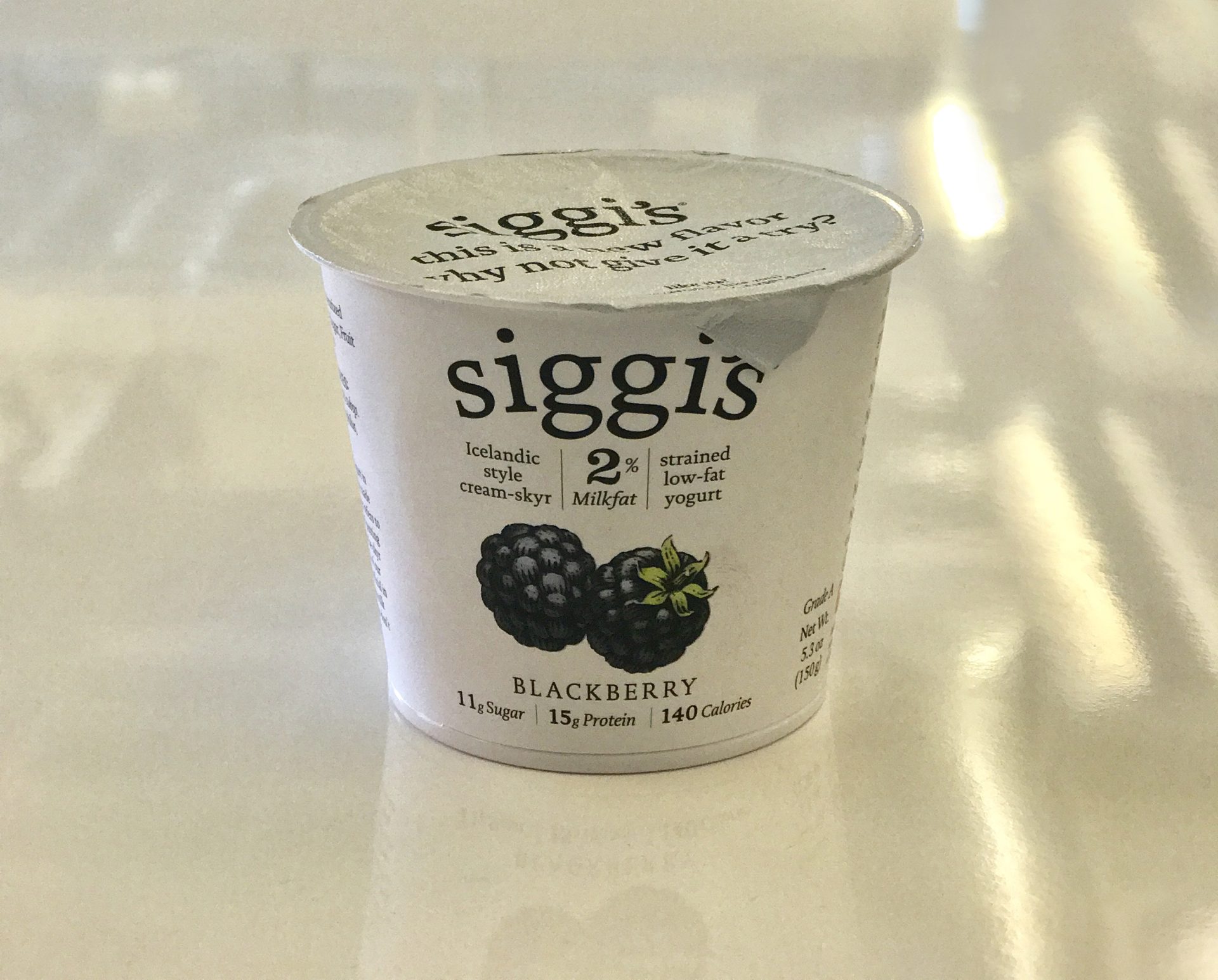
In a crowded market, the Siggi’s packaging stands out based on a few key elements that include: legible, appropriately sized and well-kerned typography; negative space against which only the most important information is presented to a customer; shelf space—top shelf suggests high quality; container shape—it’s not your typical yogurt height.
My favorite part of this packaging is the illustrations that suggest the flavor. The illustrator did an exceptional job of creating realistic, ingredient-driven illustrations while making it appear as though the ingredients are floating on the package.
I originally selected Siggi’s for a snack based on the packaging. That said, every time I return to the yogurt coolers, I stand back and look at my options and I am overwhelmed by the number of packages that are covered in white labels. There are very few that explore a different direction. Some stand out based on container shape and/or different colored lids. Others use big, bold typography.
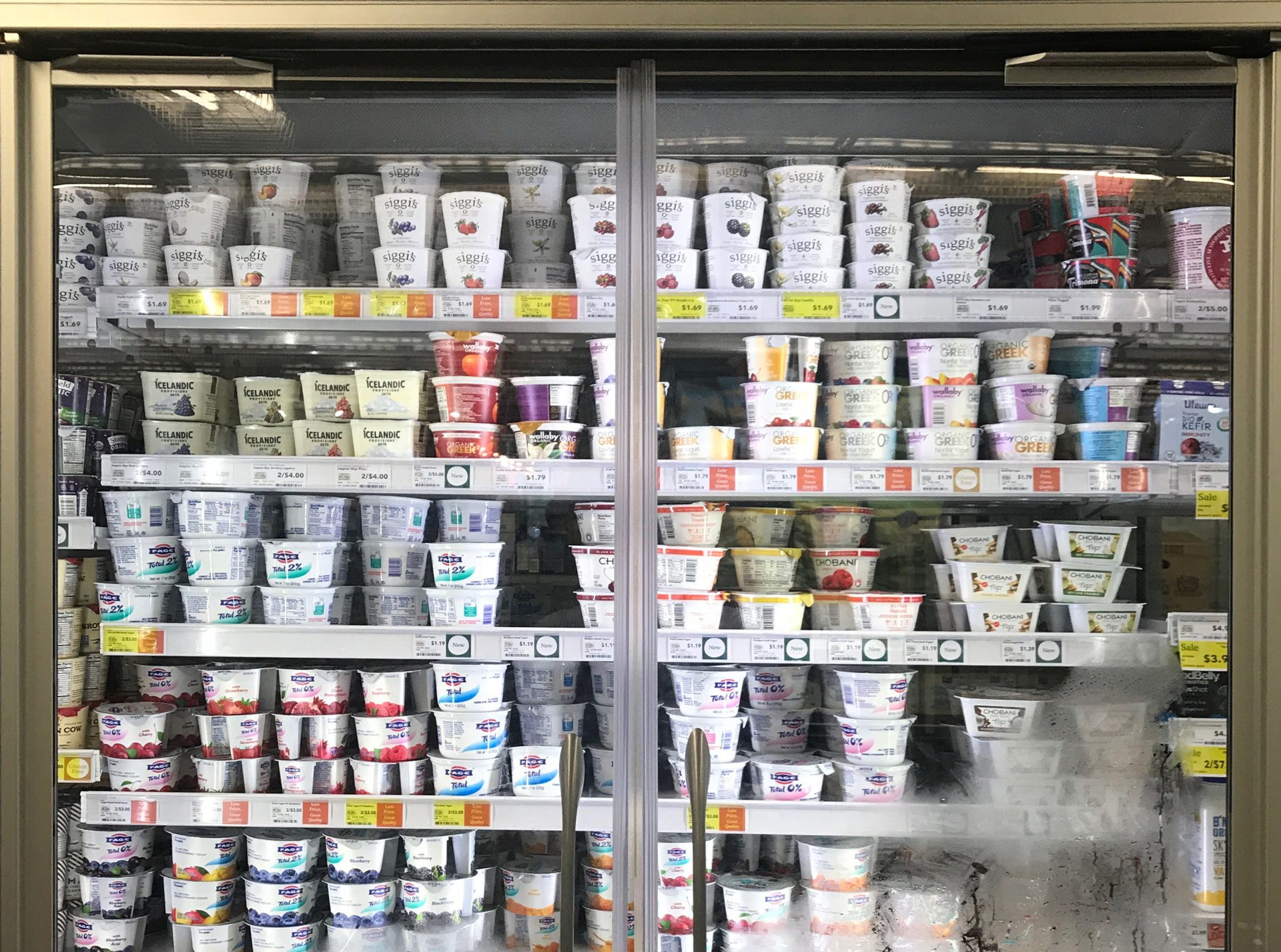
I think there is room in the category to really explore blowing out new elements and disrupting the industry standard. I suppose research might lead towards some of the decisions made, but, as a consumer, I often stand and stare at all of the brands looking for something to catch my eye, other than the product on sale or with the least amount of sugar.
I can see opportunity to update packaging with additional elements (even games) to help expand into a fully integrated marketing approach and/or campaign strategy.

