Services
- Report Design
- Responsive Web Design
Using bold messaging and compelling graphics to share a story worth telling.

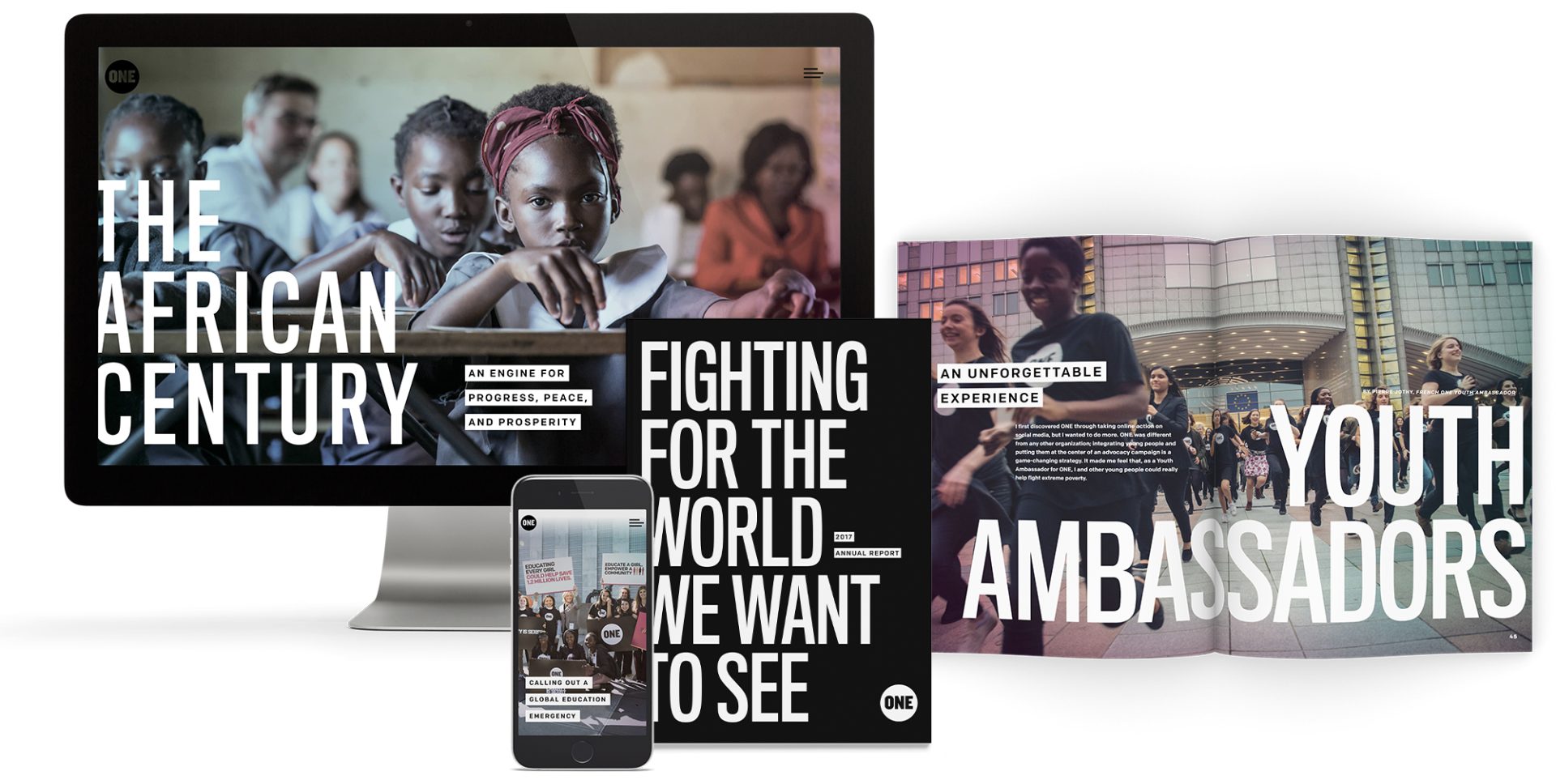
For the fifth year, global nonprofit ONE reached out to Orange Element to produce their annual report to help inform their donors and stakeholders. Each year, the report is meant to inspire a global audience of over 9 million with ONE’s mission to join the fight against extreme poverty.

Given the year’s political climate, ONE wanted to make a strong statement to the public—something that stood out amid the noise. They wanted to take a more graphic approach to highlight the challenges they faced in 2017 and the way in which they would bring about change.

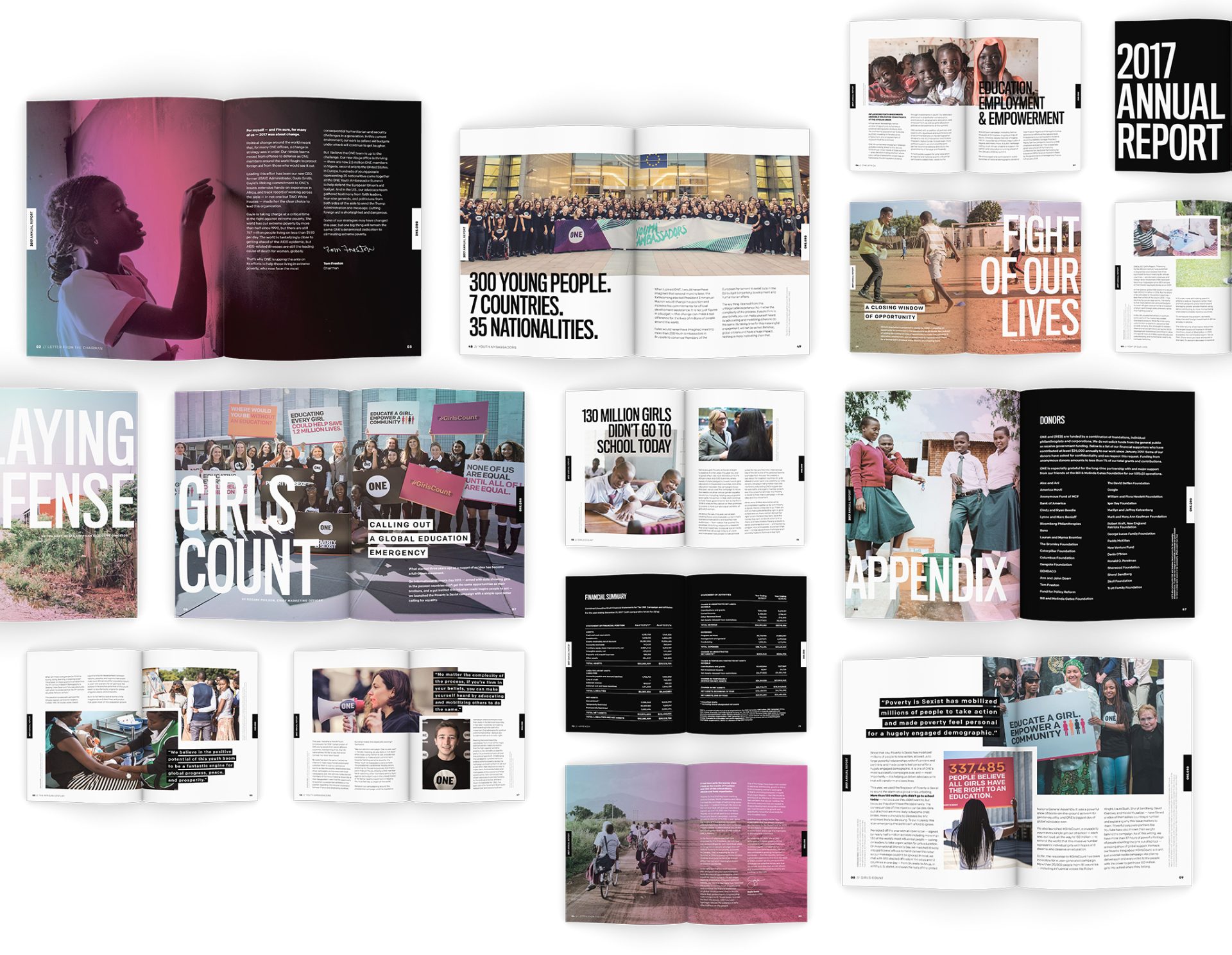
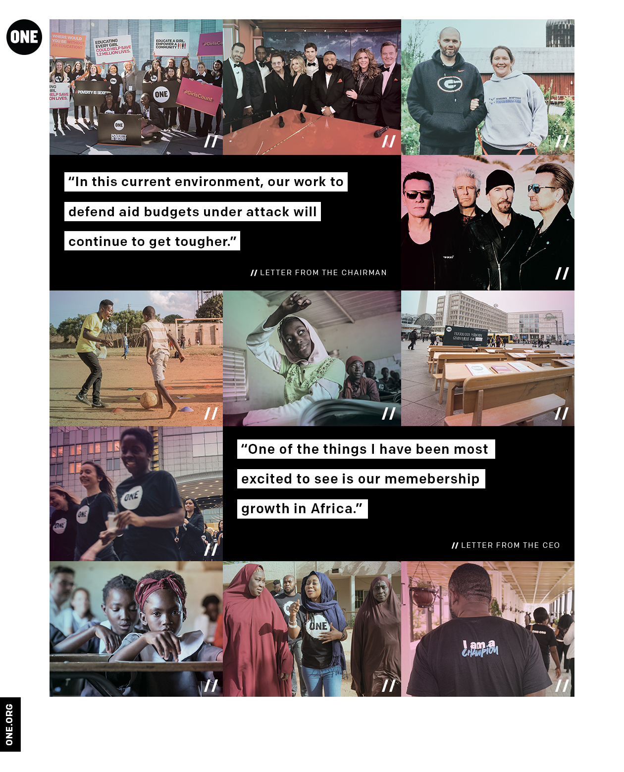
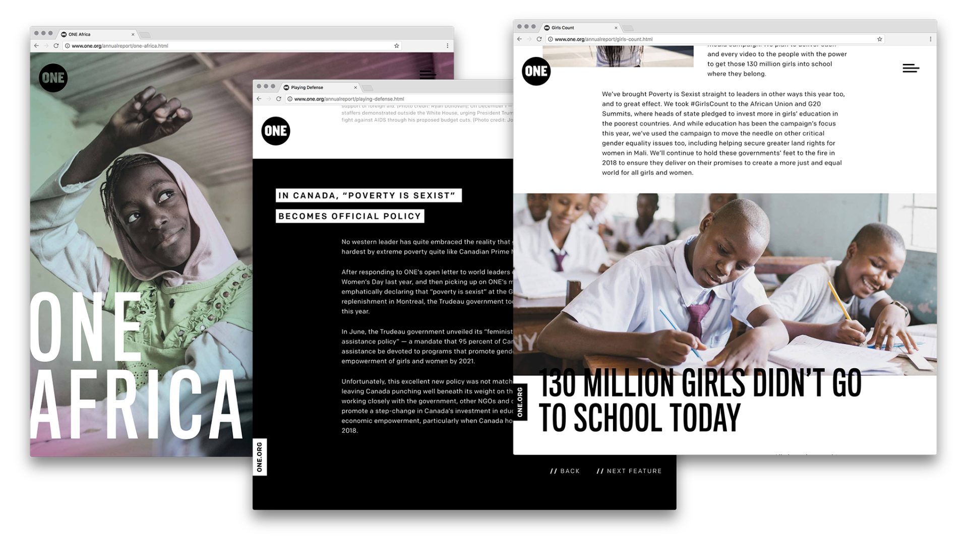
Straying away from last year’s look, this year’s design is clean and modern, using strong typography and a limited color palette. We chose a condensed Gothic typeface to mimic newspapers, which use this style to better accommodate more words on a single page. The color overlay brought in recognizable colors from their brand, which paired nicely with the toned-down saturation in the photos. We also developed a digital version of the report, which incorporated videos to support the provided content they aggregated all year.
Our team experimented with new paper and printing techniques for this smaller-sized report, such as using black paper and printed white ink. We utilized some of Mohawk’s finest papers to help this unique concept stand out.

The bold new approach for this year’s report answered the call to break through the noise of the current political climate and reach ONE’s global audience.
Notifications