In late April, Monument City Brewing Company finally opened its doors to the Baltimore community with a wildly successful grand opening featuring live music, local vendors, and plenty of new beer. For years, opening their own brewery was the dream, and Orange Element was lucky to have an inside look at the process, from business plan to brick and mortar. What once felt like such a high bar to reach is now in the rearview mirror.

With this new, exciting chapter starting to unfold, I’ve spent a great deal of time reflecting on where we started, and where we are going in our partnership. With a new brewery and increased production means new opportunities for packaging—specifically cans. We had always envisioned Monument in cans, and I remember having conversations with founders Matt and Ken about wanting to be able to load up their backpacks and hit the hiking trails with their own beer in tow—something they weren’t able to do with bottles.
It was important to us to find a visual identity that was an accurate reflection of the brand.
“When we started Monument City Brewing, it was important to us to find a visual identity that was an accurate reflection of the brand,” says Kennith Praay, Co-Founder of Monument City Brewing Company. “Orange Element was able to take the idea behind the name and what Matt and I thought was core to the brand and our city…honesty, hard work and community…and create a visual system that was perfect for our brand. The process was thorough and collaborative. We’re proud to be a part of that and excited for the continued partnership.”
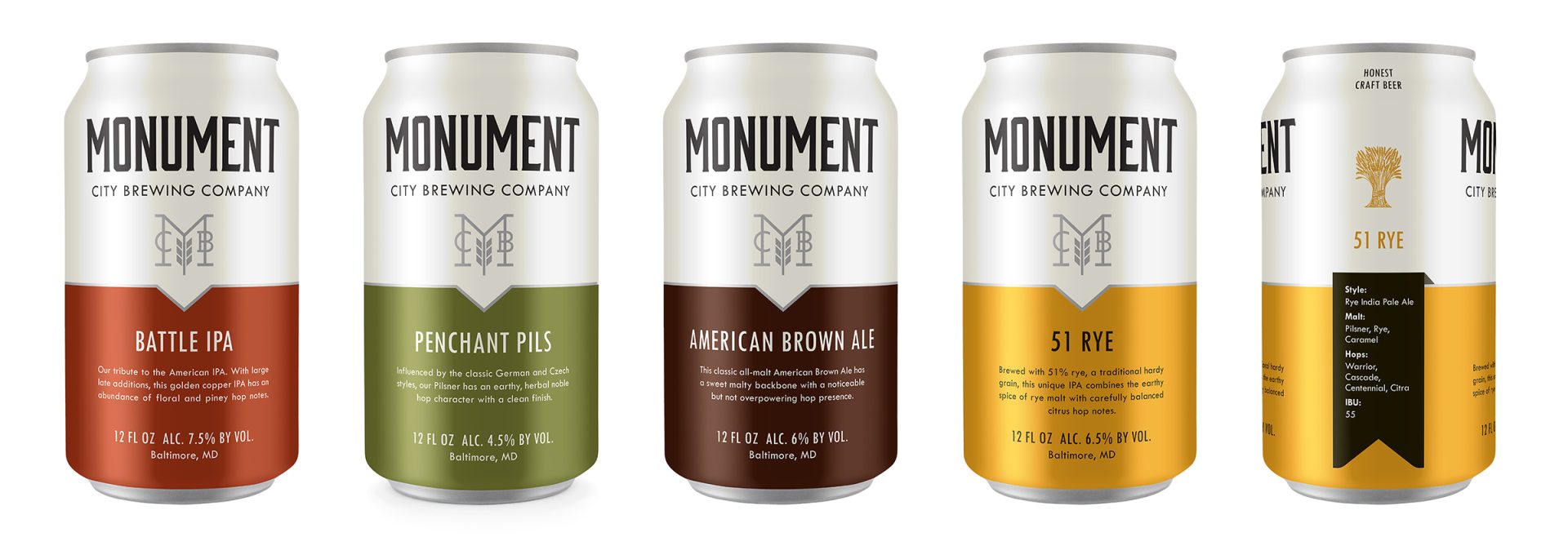
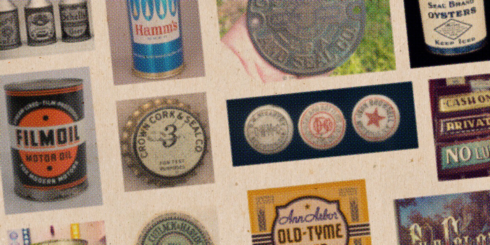
Prior to the brewery’s grand opening, we were tasked with creating a can design and promotional materials for Monument’s core offerings, as well as seasonal and limited batch brews. In order to create a design that would fit right in with the manufacturing heritage of Baltimore City, we studied everything from decades-old beer cans to farm equipment, seed packaging, and industrial labeling. It was important for Monument to capture the true spirit and history of Baltimore, and we had a great time studying what made many of those older designs so successful.

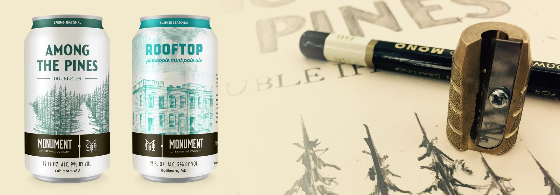
Similar to our original packaging for six-packs, bottles, and cases, we landed on a bold flood of color to identify each beer and simple iconography, along with Brewer’s Notes on packaging for the true beer enthusiast to get excited about. All of this gave us a way to clearly communicate to consumers what they can expect upon choosing Monument: straightforward, high-quality beers that stand out from the crowd. For seasonal and limited batches, minimizing the iconic color floods of the core offerings and featuring detailed, custom illustrations allowed us to tell a more complex story behind each seasonal beer and its Baltimore roots. We even broke out our pencils and created the illustrations in-house!

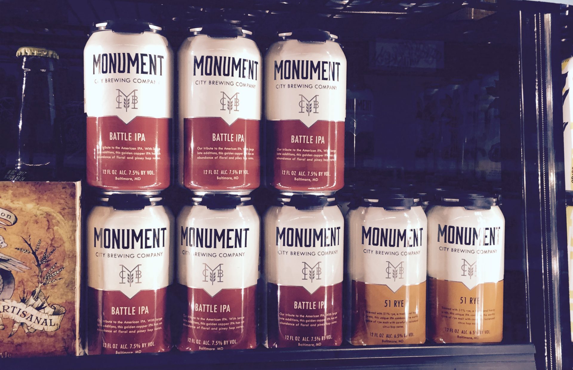
For as long as I can remember, I’ve always been interested in product packaging. I can honestly say that walking into a store to purchase a few six packs of Monument cans, something I had a direct hand in designing, was just as exciting as I’d always hoped—even if I did get a few stares as I took pictures of the refrigerator case. Seeing our design in the wild was not only a thrill, but confirmed that we achieved what we set out to do in creating an iconic design that would jump off the shelf and stand out among so many other labels and brands.

We’re excited to share everything we’ve been working on, so continue to watch the shelves at your local store as Monument rolls out new seasonal beers throughout the year!
To check out the brewery for yourself and sample Monument’s latest limited brews, be sure to stop by the taproom at 1 North Haven Street, Baltimore, MD 21224. For hours and additional information, visit MonumentCityBrewing.com. Or, stop by your local shop to take home a six pack!


